UI Design · UI Design · UI Design · UI Design · UI Design · UI Design · UI Design · UI Design · UI Design · UI Design · UI Design · UI Design · UI Design ·
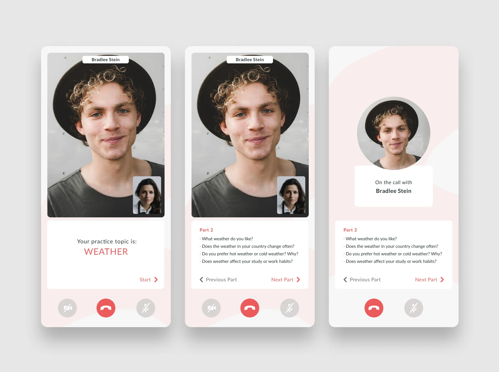
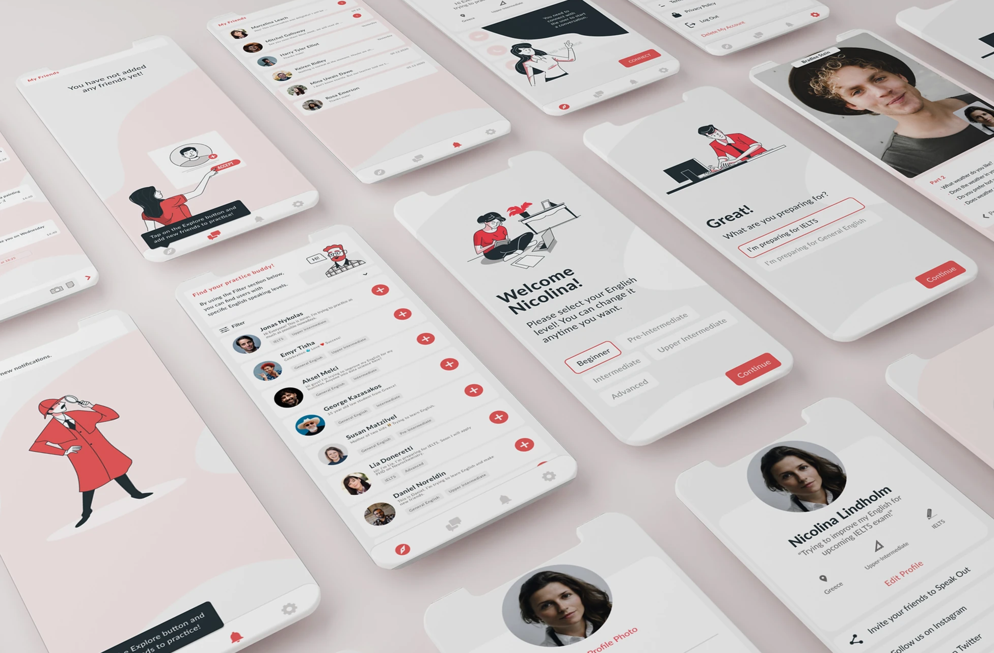
Speak Out functions as a mobile application that facilitates English practice sessions between individuals worldwide. Irrespective of their proficiency level and practice motives, users can expand their network by adding friends and engaging in video/phone conversations. These interactions are enhanced as the app provides prompts on particular discussion subjects.
The creator of this app approached me while I was seeking fresh UI ventures to enhance my portfolio. This page showcases the upcoming application designs that are poised for implementation. I will also endeavor to elucidate the conceptualization behind these design choices as I recount my creative journey.
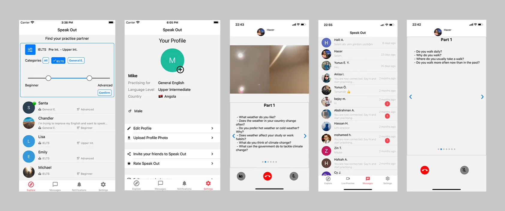
Before the redesign:
What was the goal?
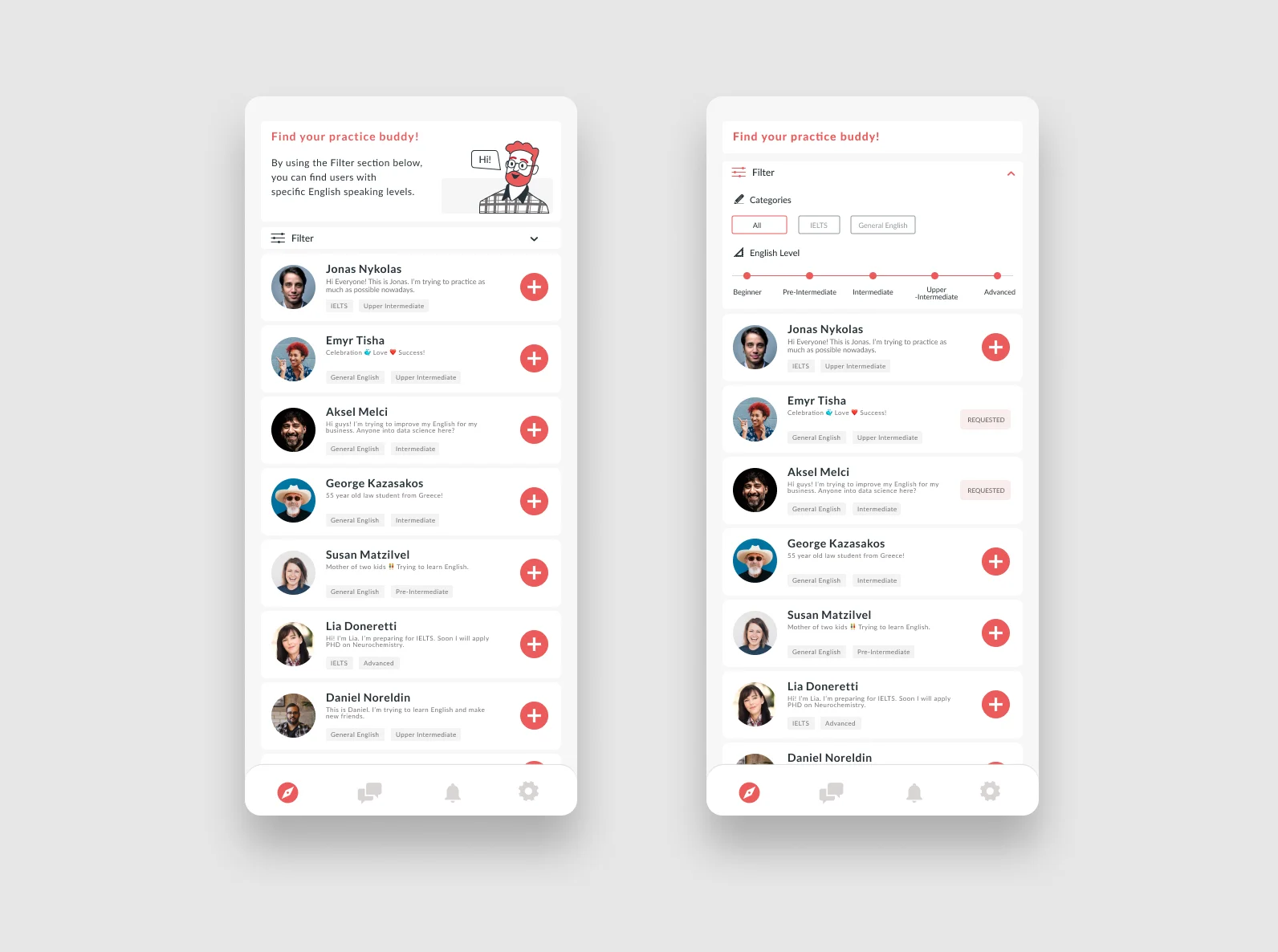
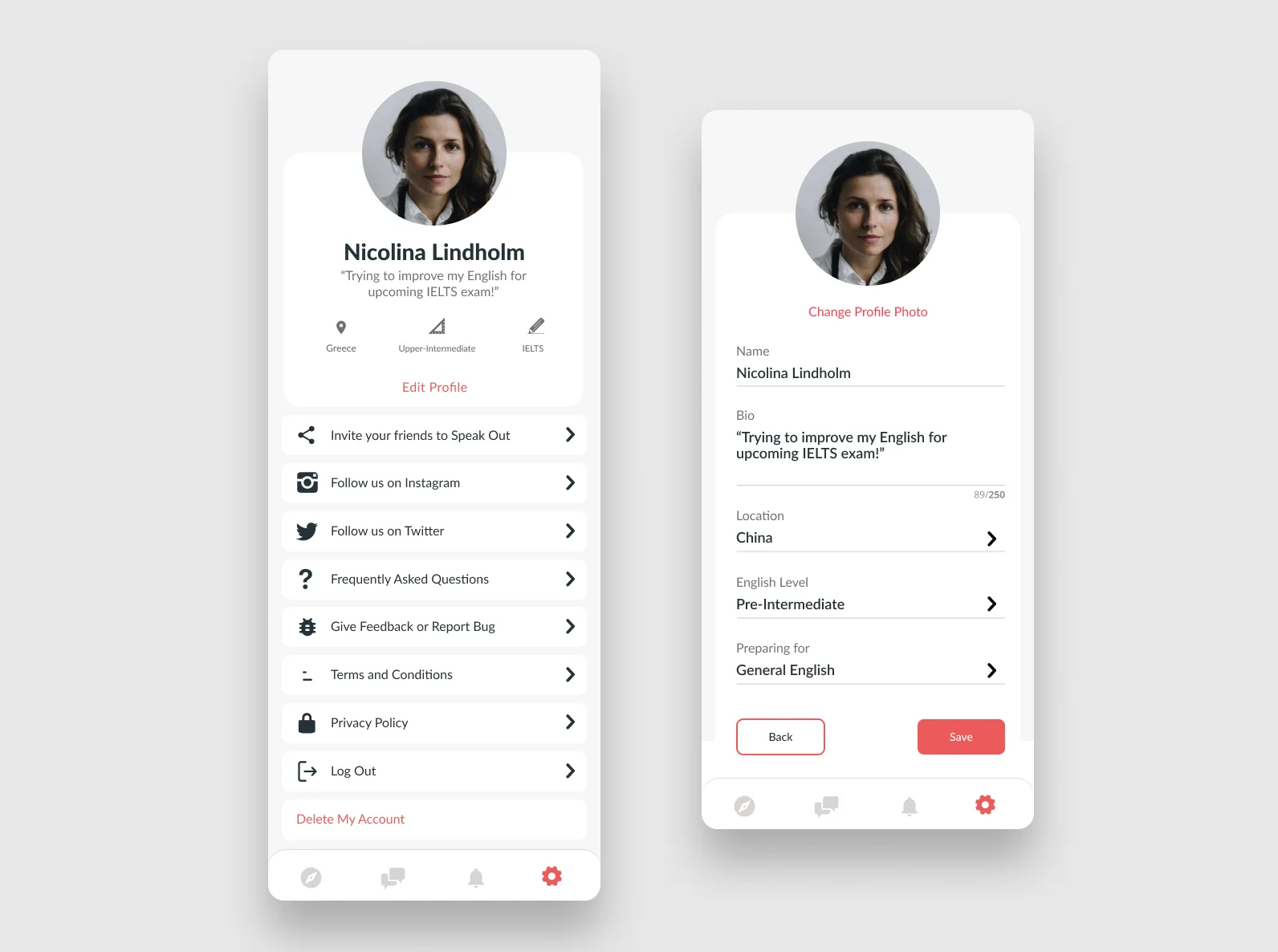
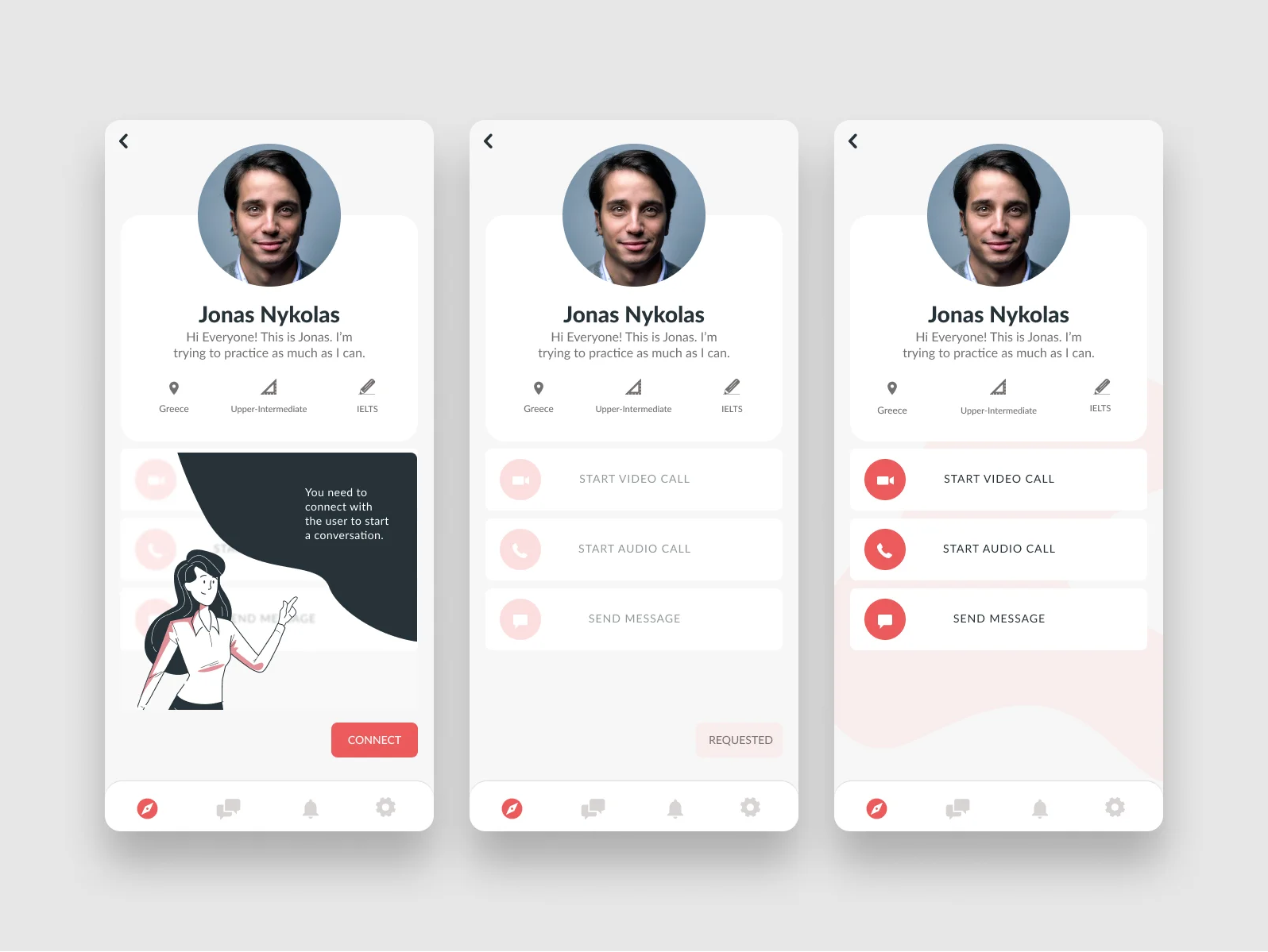
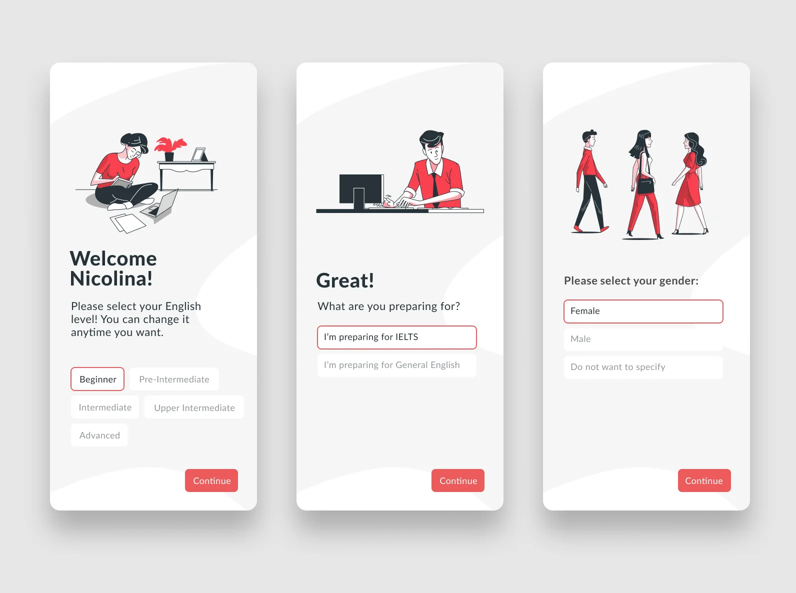
My primary goal was to create an attractive and user-friendly appearance for the app. While the app's current design is functional, it doesn't quite follow some important design principles.
I focused on making the important buttons really noticeable, and I gave them distinct looks for the most important ones and the less important ones. After trying out a few different styles, I settled on a font called Lato for the app. It's a font that's widely recognized and comes in different styles, which makes it easy to read on the internet. I also avoided using black text color because it can strain the eyes, especially when there's a lot of reading to do.
I discovered that about half of the app users want to practice general English skills, and a bit more than a quarter of the users are still learning and are at the beginner or intermediate level. To enhance the app's visual appeal and help users understand how to use it better, I created some illustrations using a website called Freepik's Storyset. These illustrations not only make the app more enjoyable but also serve as helpful guides for users as they navigate the app's features.